.png)
Dashboards - Power BI
1. Executive Summary Dashboard
The Executive Summary Dashboard provides a comprehensive 360-degree view of the current state of shipments per the creation date, enabling stakeholders to monitor and manage logistics operations effectively through GN TEQ LIS. This dashboard is equipped with advanced filtering options to customize the data display according to specific requirements, ensuring relevant insights are readily accessible.
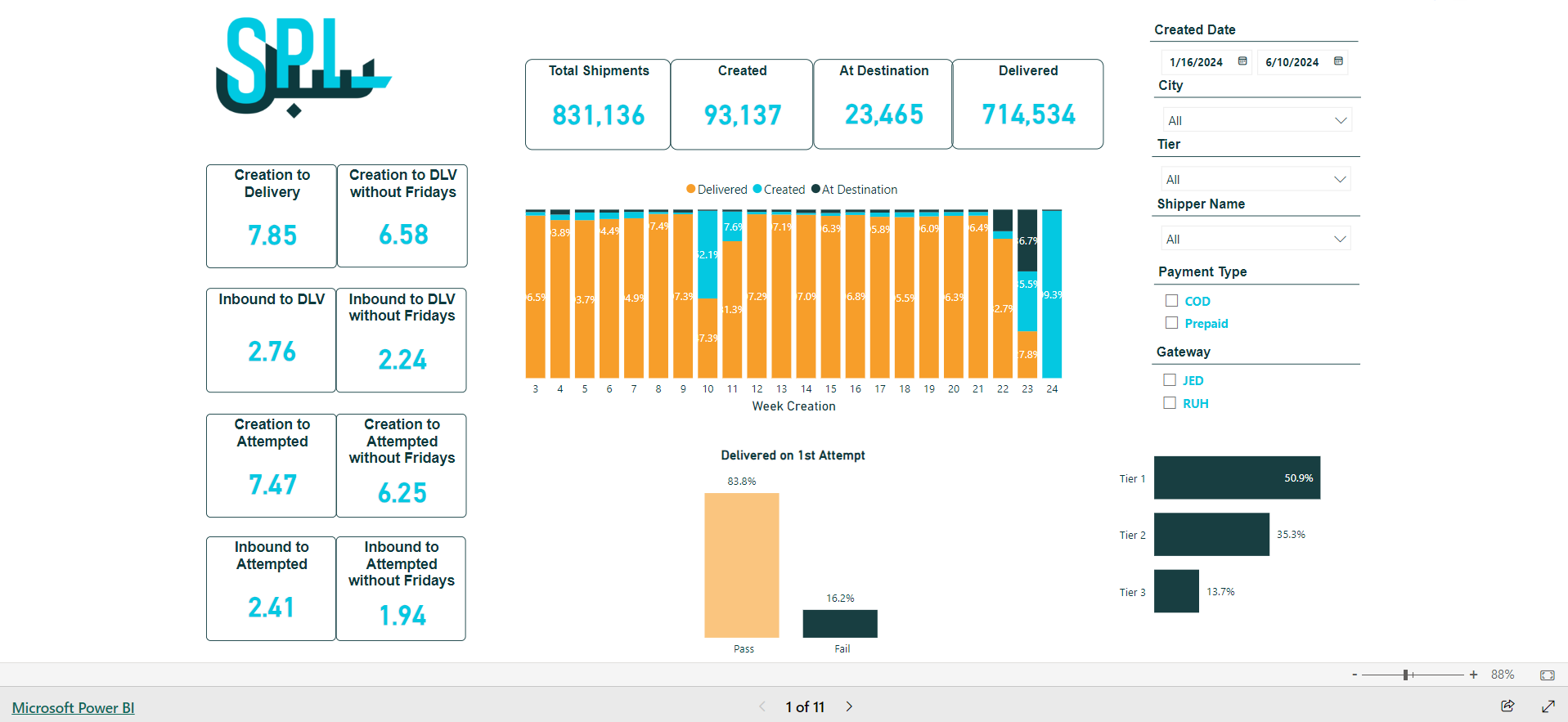
Figure 1- Executive Summary
Created Date: This filter defines the creation date range in the system for searching the shipments to view their related data.
City: This filter represents the final destination, indicating the consignee city.
Tier: This filter represents the shipment’s destination tier.
Shipper Name: This filter represents the source of the shipment.
Payment Type: This filter represents the payment method used by the consignee.
Gateway: This filter represents the airport where the shipments reach their destination.
Total Shipments: This card shows the number of shipments handled in the system within the selected creation date range, regardless of their status.
Created: This card shows the number of shipments created in the system within the selected creation date range that have not yet physically moved.
At Destination: This card shows the number of the shipments that have reached their destination but have not yet been delivered.
Delivered: This card shows the number of the shipments that have been delivered.
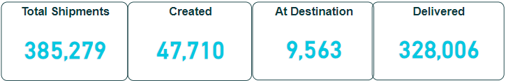
This bar chart shows the percentage of the shipments per status (Delivered, Created, At Destination) for each week of the year according to the selected creation date.
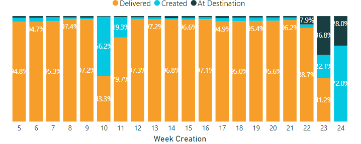
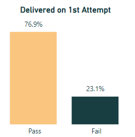
This column chart shows the percentage of shipments that were delivered on the 1st attempt vs those that failed to be delivered on the 1st attempt, according to the selected creation date.
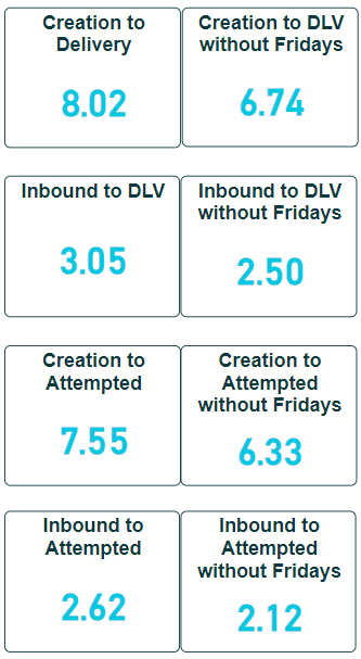
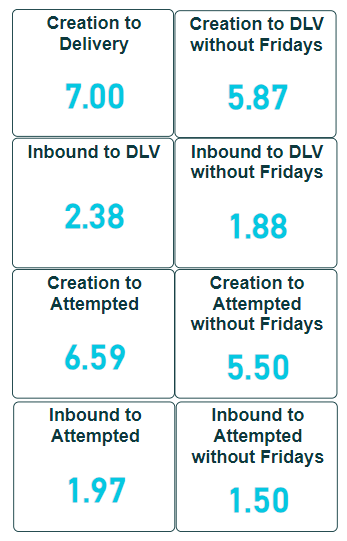
These cards show the transit time for the shipments from creation to delivery or attempted delivery, and from inbound to delivery or attempted delivery.
Note:
The right column considers the transit time for the shipment according to calendar days.
The left column considers the transit time for the shipment according to working days, excluding Fridays.
2. SHIB Executive Summary Dashboard
The Shipment Inbound Executive Summary Dashboard provides a comprehensive view of shipment data similar to the Executive Summary Dashboard, based on the first inbound scanning date, enabling stakeholders to monitor and manage logistics operations effectively through GN TEQ LIS. This dashboard is equipped with advanced filtering options to customize the data display according to specific requirements, ensuring relevant insights are readily accessible.
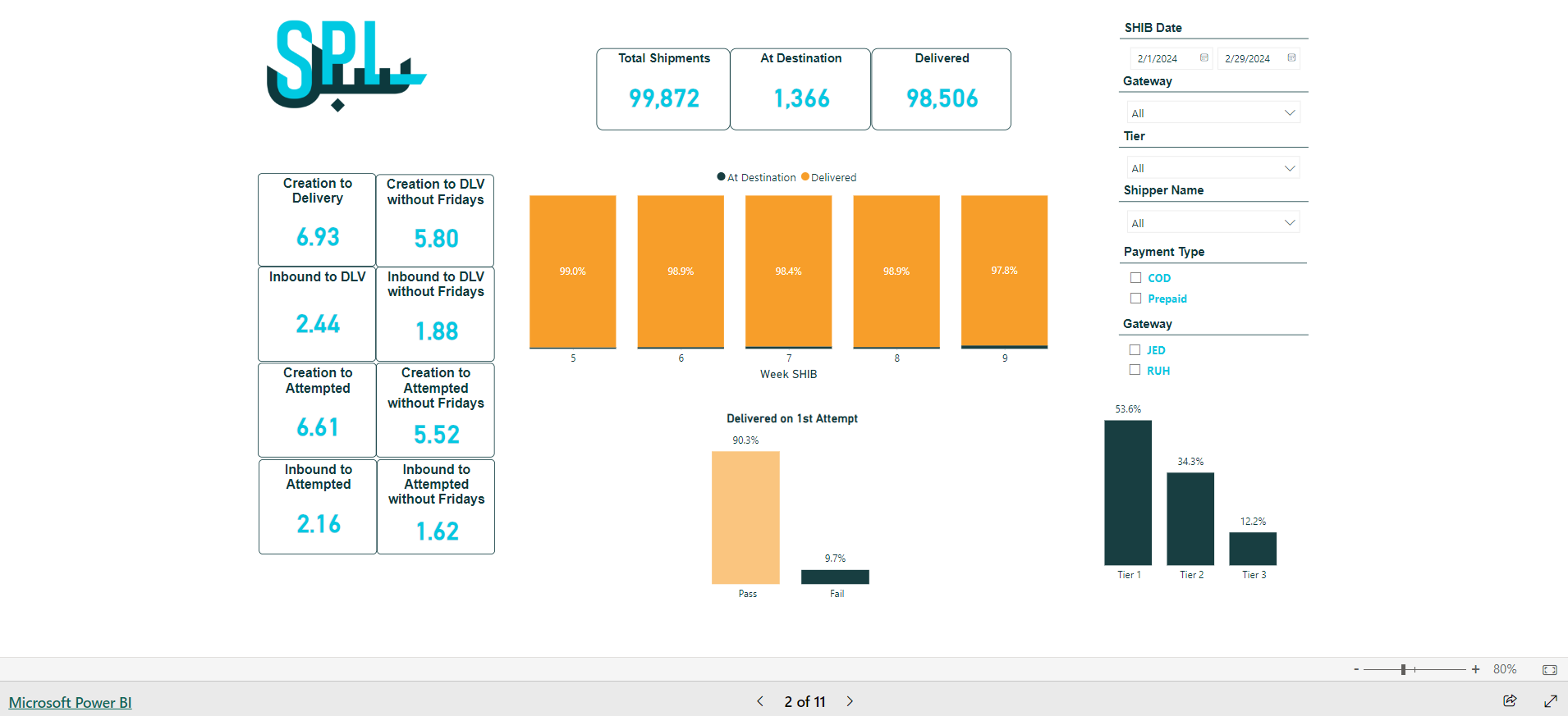
Figure 2- SHIB Executive Summary
SHIB Date: This filter defines the shipment inbound scanning date range in the system for searching shipments to view their related data.
City: This filter represents the final destination, indicating the consignee city.
Tier: This filter represents the shipment’s destination tier.
Shipper Name: This filter represents the source of the shipment.
Payment Type: This filter represents the payment method used by the consignee.
Gateway: This filter represents the airport where the shipments reach their destination.
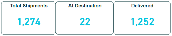
Total Shipments: This card shows the number of shipments handled in the system within the selected inbound scanning date range, regardless of their status.
At Destination: This card shows the number of shipments that have reached their destination but have not yet been delivered.
Delivered: This card shows the number of shipments that have been delivered.
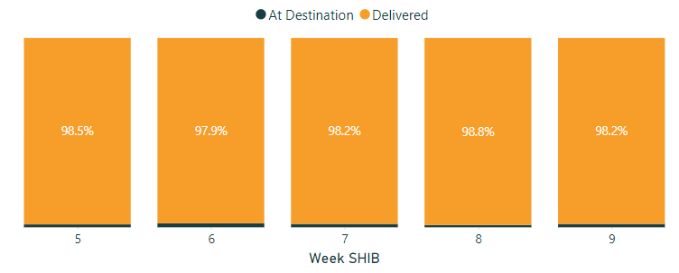
This bar chart shows the percentage of shipments per status (At Destination, Delivered) for each week of the year according to the selected inbound scanning date.
This column chart shows the percentage of shipments that have been successfully delivered on the 1st attempt vs those that failed to be delivered on the 1st attempt, based on the inbound scanning date.
These cards show the transit time for shipments from creation to delivery or attempted delivery, and from inbound to delivery or attempted delivery.
Note:
The right column considers the transit time for shipments according to calendar days.
The left column considers the transit time for shipments according to working days, excluding Fridays.
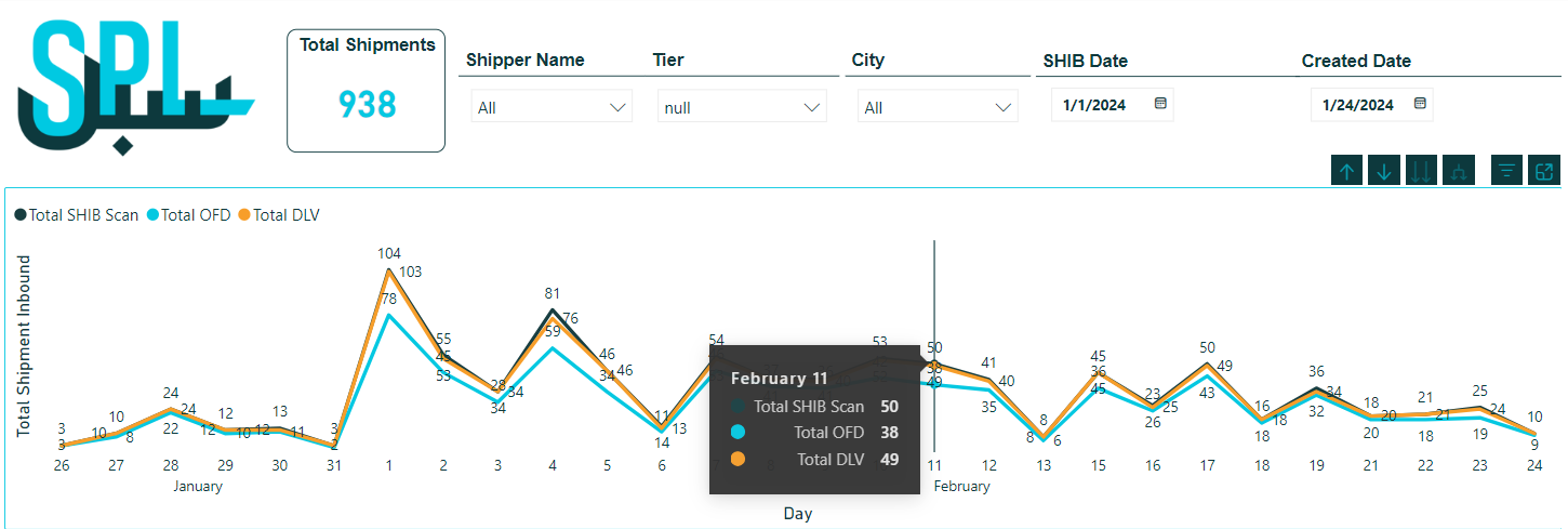
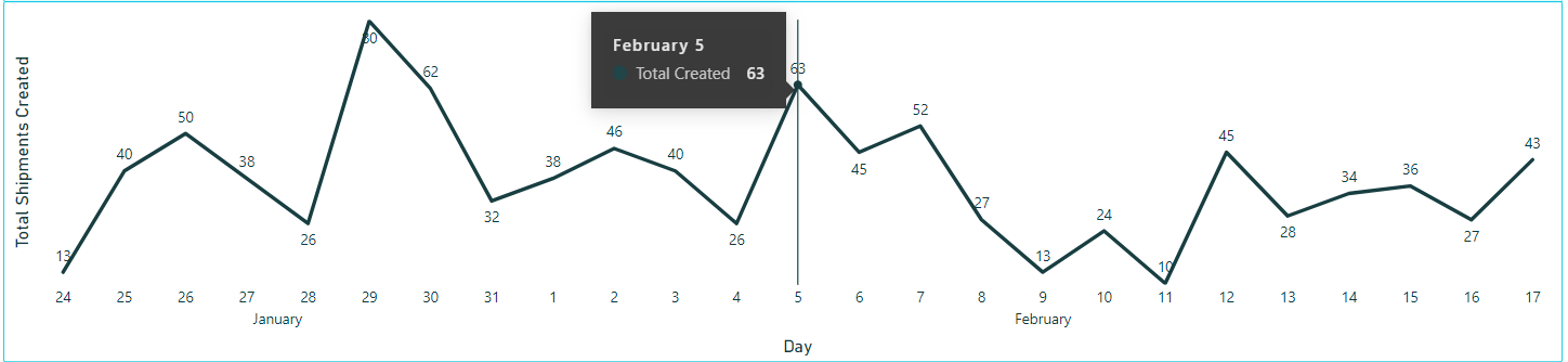
3. Volumes Per Day Dashboard
The Volume Per Day Dashboard provides an in-depth analysis of shipment distribution over time, allowing users to monitor and manage the daily shipment volumes accurately. This dashboard is equipped with various filters to offer customized views, helping businesses understand shipment patterns and optimize their logistics operations.
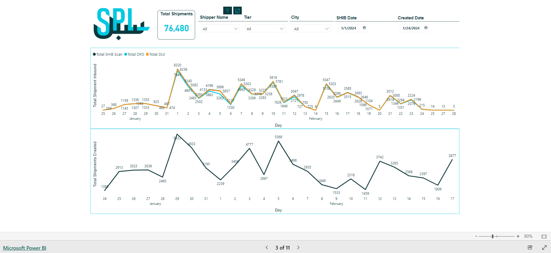
Figure 3- Volumes Per Day
Created Date: This filter defines the creation date in the system for searching shipments to view their related data.
SHIB Date: This filter defines the shipment inbound scanning date.
City: This filter represents the final destination, indicating the consignee city.
Tier: This filter represents the shipment’s destination tier.
Shipper Name: This filter represents the source of the shipment.
According to the selected filters, the dashboard will show the following:
Total Shipments: This card shows the number of shipments handled in the system based on the selected filters
Total Shipments Inbound Chart: This chart shows the distribution of total inbound shipments per day, where each day shows the total shipment per:
Total SHIB scan: this represents the number of the inbound scanned shipments.
Total OFD: This represents the number of shipments out for delivery.
Total DLV: this represents the number of delivered shipments.
Total Shipment Created Chat: This chart shows the distribution of total shipments created per day, where each day shows the total number of shipments.
4. Delivery Performance Dashboard
The Delivery Performance Dashboard provides a comprehensive overview of shipment delivery statuses, focusing on both delivered and out-for-delivery shipments in relation to Service Level Agreements (SLAs). This dashboard is designed to help businesses monitor delivery efficiency, ensure compliance with SLAs, and identify areas for improvement in the delivery process.
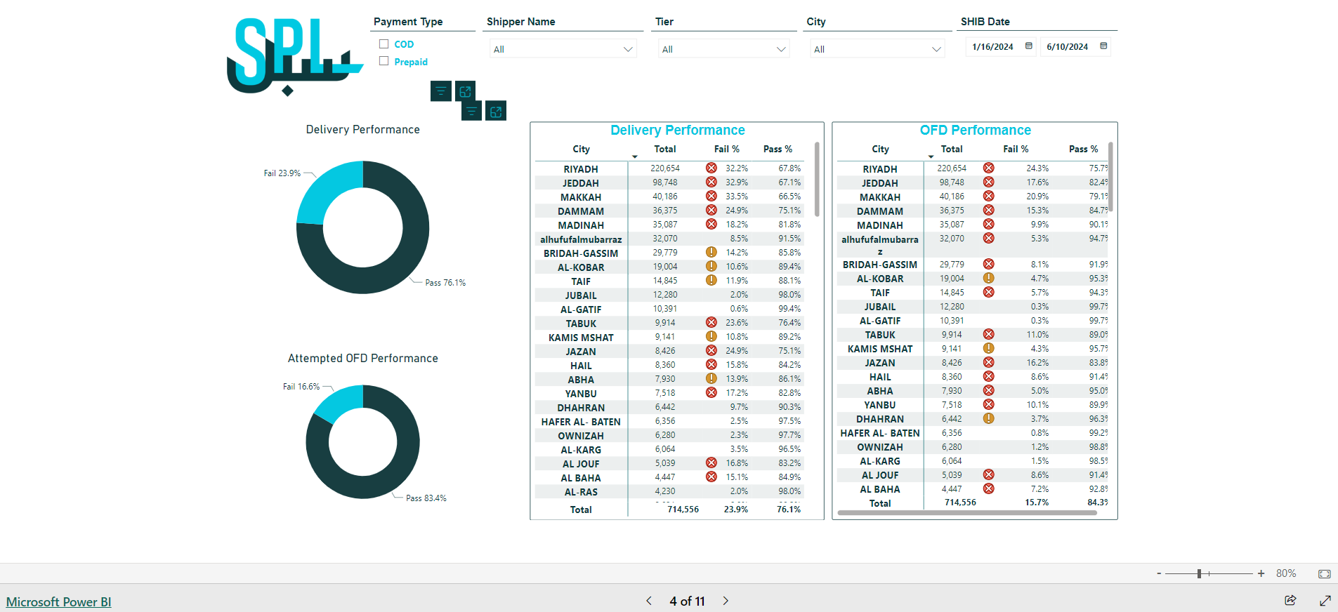
Figure 4- Delivery Performance
SHIB Date: This filter defines the shipment inbound scanning date.
City: This filter represents the final destination, indicating the consignee city.
Tier: This filter represents the shipment’s destination tier.
Shipper Name: This filter represents the source of the shipment.
Payment Type: This filter represents the payment method used by the consignee.
According to the selected filters, the dashboard will show the following:
Delivery Performance Table: This table shows the total number of delivered shipments per city, along with the percentage of shipments that meet SLA versus those that failed to meet SLA.
Delivery Performance by Chart: This chart shows the percentage of delivered shipments that meet SLA versus those that failed to meet SLA.
OFD Performance Table: This table shows the total number of out for delivery shipments per city, along with the percentage of shipments that meet SLA versus those that failed to meet SLA.
OFD Performance Chart: This chart shows the percentage of out for delivery shipments that meet SLA versus those that failed to meet SLA.
5. Transit Time Dashboard
The Transit Time Dashboard provides a detailed overview of the shipments’ transit times, tracking the duration from creation to delivery considering calendar days. This dashboard is designed to help businesses analyze and optimize their shipping processes by offering insights from multiple perspectives, ensuring timely and efficient deliveries.
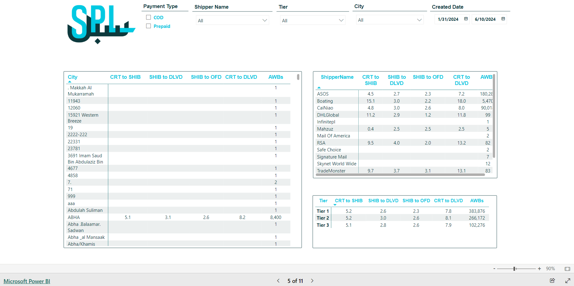
Figure 5- Transit time
Created Date: This filter defines the creation date range in the system for searching shipments to view their related data.
City: This filter represents the final destination, indicating the consignee city.
Tier: This filter represents the shipment’s destination tier.
Shipper Name: This filter represents the source of the shipment.
Payment Type: This filter represents the payment method used by the consignee.
According to the selected filters, the dashboard will show the following:
Shipments Transit Time per City: This table shows the average transit time for shipments per city based on tracking events, along with the total number of shipments (AWBs).
Shipments Transit Time per Shipper Name: This table shows the average transit time for shipments per shipper name based on tracking events, along with the total number of shipments (AWBs).
Shipments Transit Time per Tier: This table shows the average transit time for shipments per tier based on tracking events, along with the total number of shipments (AWBs).
The tracking shipment event are:
CRT to SHIB: from creation to inbound scan.
SHIB to DLVD: from inbound scan to delivered.
SHIB to OFD: from inbound scan to out for delivery.
CRT to DLVD: from creation to delivered.
6. Transit Time - Exc Friday Dashboard
The Transit Time Dashboard - Exc Friday provides a comprehensive view of Transit Time similar to the standard Transit Time Dashboard but considers only working days. It provides a detailed overview of the transit times for shipments, tracking the duration from creation to delivery. This dashboard is designed to help businesses analyze and optimize their shipping processes by offering insights from multiple perspectives, ensuring timely and efficient deliveries.
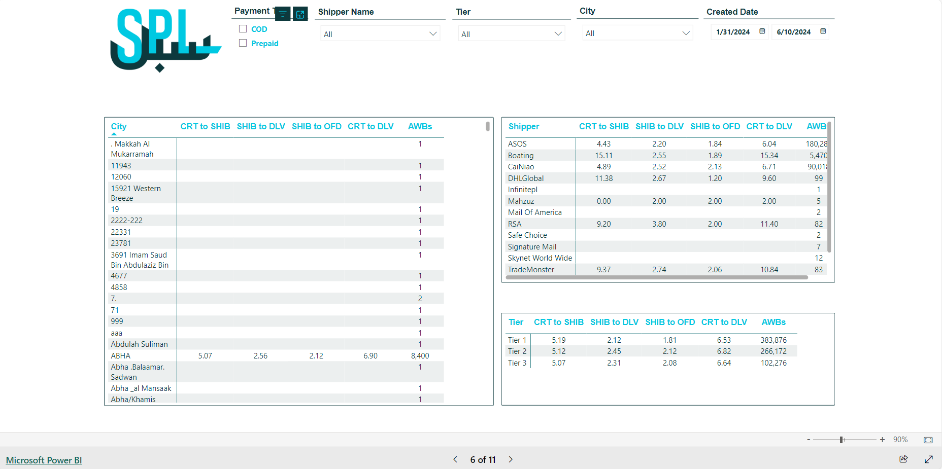
Figure 6- transit Time - Exc Friday
Created Date: This filter defines the creation date range in the system for searching shipments to view its related data.
City: This filter represents the final destination, indicating the consignee city.
Tier: This filter represents the shipment’s destination tier.
Shipper Name: This filter represents the source of the shipment.
Payment Type: This filter represents the payment method used by the consignee.
According to the selected filters, the dashboard will show the following:
Shipments Transit Time per City: This table shows the average transit time for shipments per city based on tracking events, along with the total number of shipments (AWBs).
Shipments Transit Time per Shipper Name: This table shows the average transit time for shipments per shipper name based on tracking events, along with the total number of shipments (AWBs).
Shipments Transit Time per Tier: This table shows the average transit time for shipments per tier based on tracking events, along with the total number of shipments (AWBs).
The tracking shipment event are:
CRT to SHIB: from creation to inbound scan.
SHIB to DLVD: from inbound scan to delivered.
SHIB to OFD: from inbound scan to out for delivery.
CRT to DLVD: from creation to delivered.
Note:
The Transit Time considers only the working days without Fridays.
7. Shipment Status Search Dashboard
The Shipment Status Search Dashboard provides a comprehensive overview of shipments (AWBs) and related data. This dashboard is designed to help businesses quickly access detailed information about individual shipments, track their status, and manage logistics effectively.
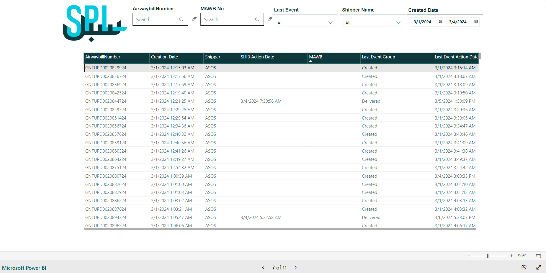
Figure 7- Shipment Status Search
Created Date: This filter defines the creation date range in the system for searching the shipments to view its related data.
Shipper Name: This filter represents the source of the shipment.
Last Event: This filter lists the shipment event.
MAWB No.: This field is for entering the shipment’s MAWB number.
Airway bill Number: This field is for entering the shipment’s number.
According to the selected filters, the table will show the following:
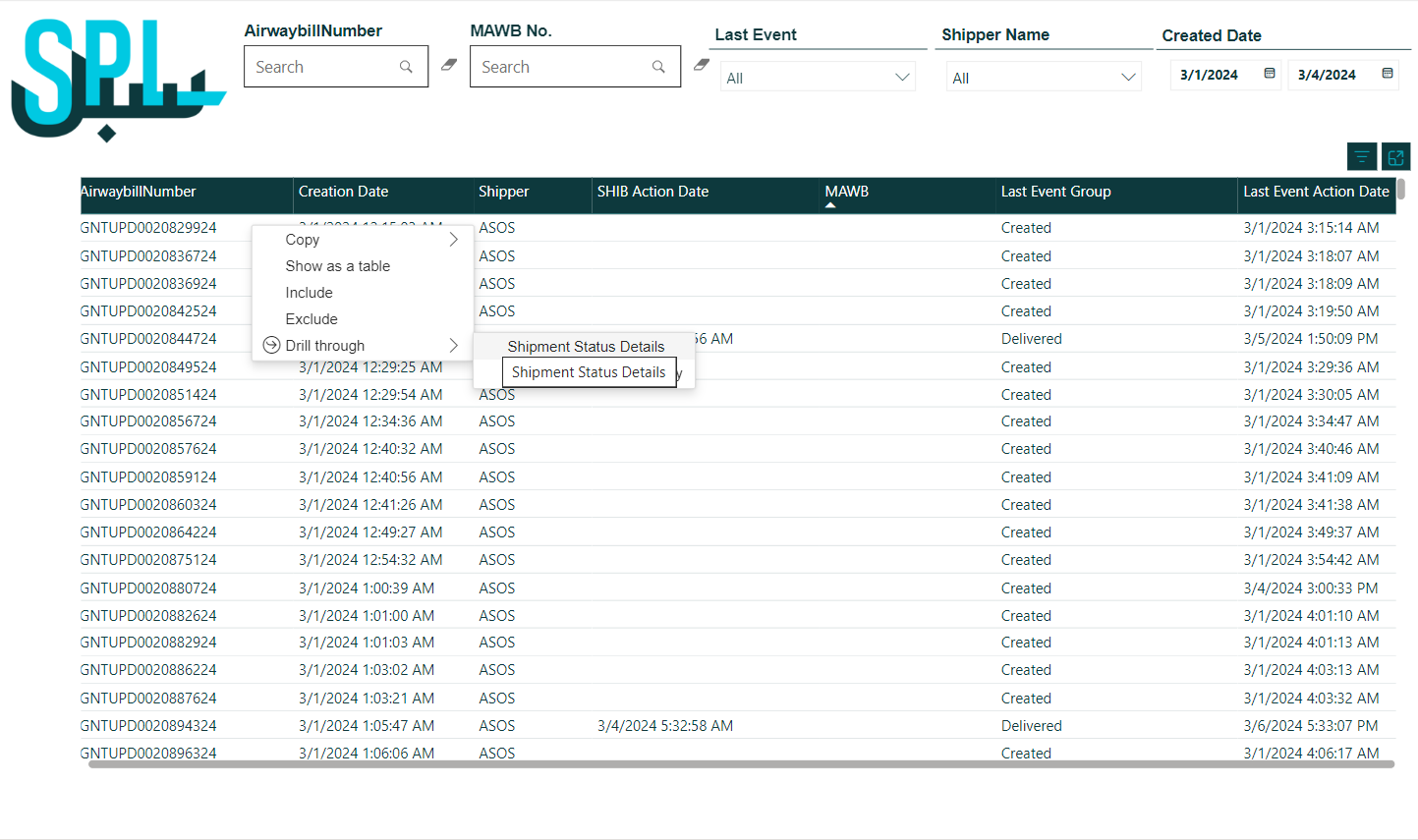
AWB Number: This represents the shipment number, which can be clicked to drill down for more details about the shipment.
Creation Date: This represents the shipment creation date in the system.
Shipper: This represents the suppliers' customer that sends the shipment.
SHIB Action Date: This represents the shipment inbound scan date.
MAWB No.: This represents the master airwaybill number for the shipment.
Last Event Group: This represents the last event that occurs for the shipment.
Last Event Action Date: This represents the last event’s date that occurs for the shipment.
8. Shipment Status Summary Dashboard
The Shipment Status Summary Dashboard provides a comprehensive overview of shipments (AWBs), categorized by shipper. This dashboard is designed to offer insights into the performance and status of shipments from different shippers, helping businesses manage logistics operations effectively.
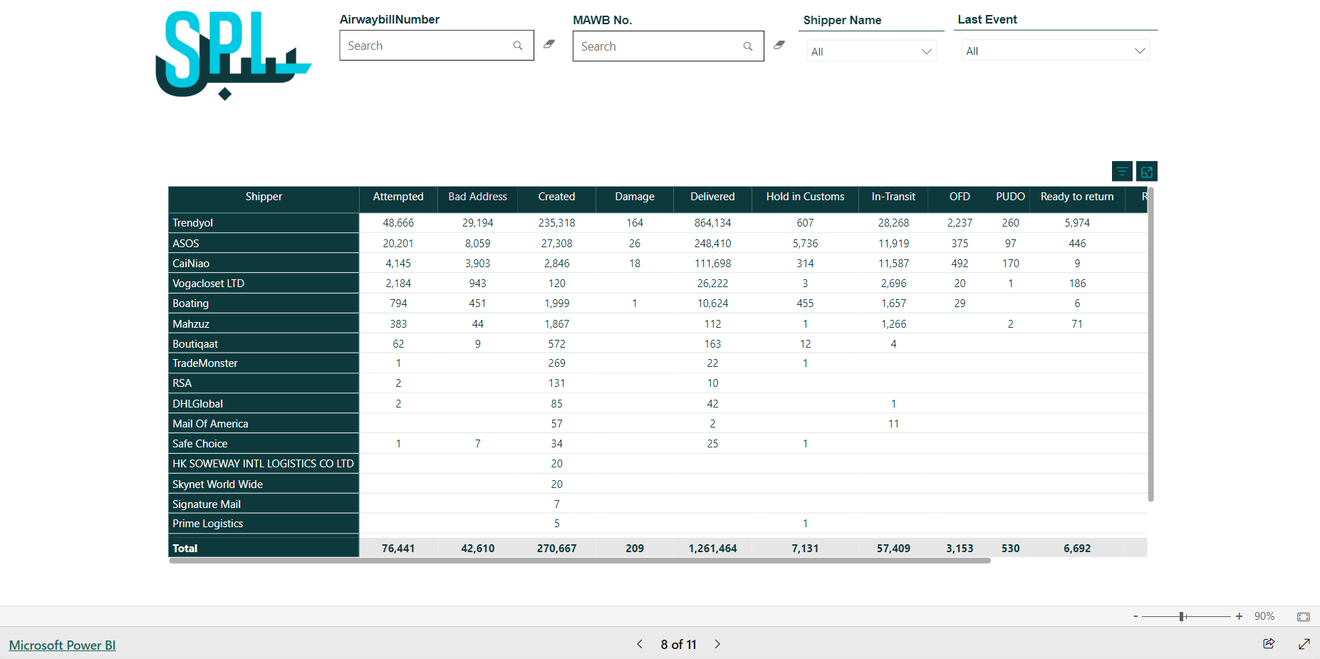
Figure 8- Shipment Status Summary
Last Event: This filter lists the shipment events.
Shipper Name: This filter represents the source of the shipment.
MAWB No.: This represents the master airwaybill number for the shipment.
Airwaybill Number: This field is for entering the shipment’s number.
According to the selected filters, the table will show the following:
Shipper: This represents the source of the shipment.
Attempted: This represents the number of delivery attempts
Bad Address: This represents the number of shipments with incorrect address.
Created: This represents the number of shipments created in the system that have not yet been physically moved on the ground.
Damage: This represents the number of disposed shipments.
Delivered: This represents the number of delivered shipments.
Hold in Customs: This represents the number of shipments held in customs.
In Transit: This represents the number of shipments in transit.
OFD: This represents the number of the shipments that are out for delivery
PUDO: This represents the number of shipments ready for collection by the consignee or drop off as part of the return.
Ready to Return: This represents the number of shipments ready for return.
Returned: This represents the number of returned shipments.
9. Int. Ecommerce Performance Dashboard
The International E-commerce Performance Dashboard offers a detailed summary of revenue based on billing and commercial agreements for each customer. This dashboard is designed to help businesses track financial performance, manage customer agreements, and optimize their international e-commerce operations.
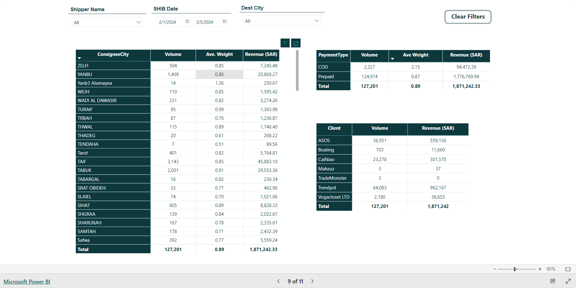
Figure 9- Int. Ecommerce Performance
Shipper Name: This filter represents the source of the shipment.
SHIB Date: This represents the shipment’s inbound scan date.
Dest City: This filter shows the list of destination cities.
According to the selected filters, the table will show the following:
Shipments Volume and Revenue per Client: this table shows the volume of shipments triggered by inbound scans for billing, along with the revenue generated per client.
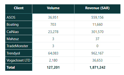
Shipments Volume and Revenue per Payment Type: this table shows the volume of shipments triggered by inbound scans for billing, along with their revenue categorized by payment type either COD or Prepaid.
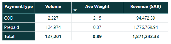
Shipments Volume and Revenue per Consignee City: this table shows the volume of shipments triggered by inbound scans for billing, along with the revenue generated per consignee city.

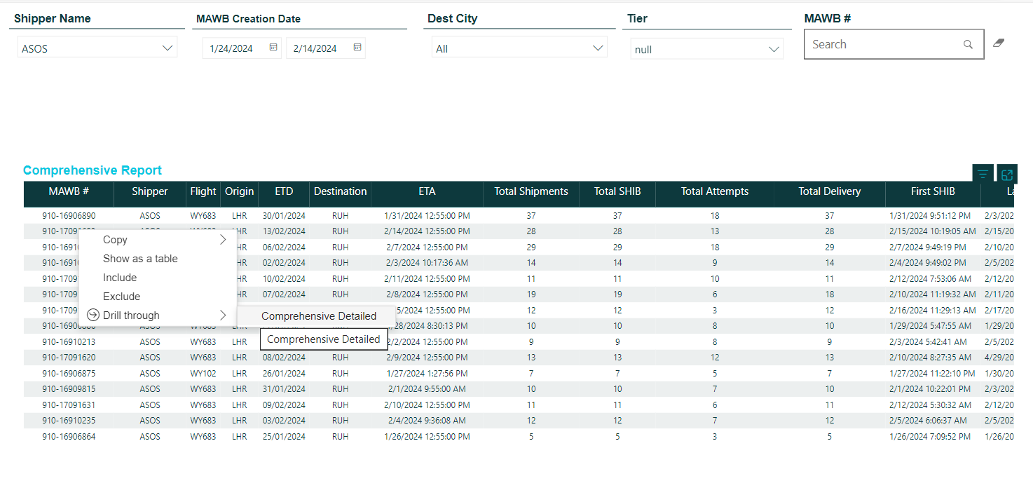
10. Comprehensive Report Dashboard
The Comprehensive Report Dashboard provides a comprehensive overview of master airwaybills (MAWBs) and related data. This dashboard is designed to help businesses quickly access detailed information about individual shipments, track their statuses, and manage logistics operations.
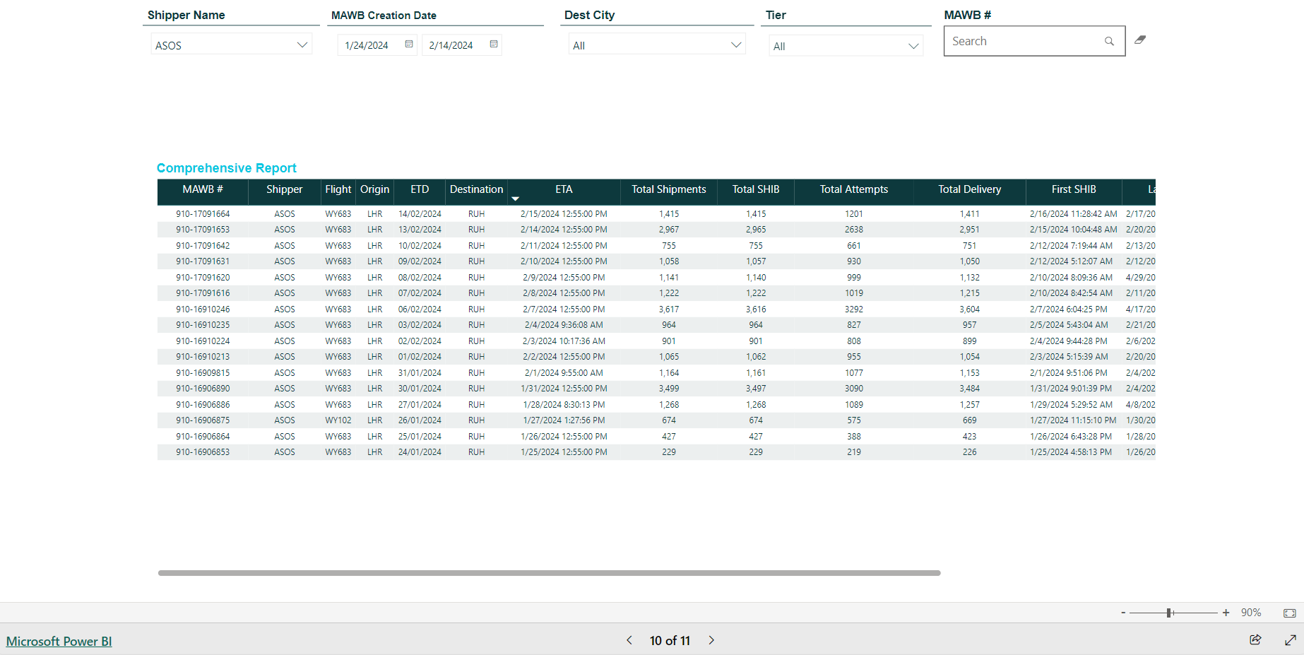
Figure 10- Comprehensive Report
Shipper Name: This filter represents the source of the shipment.
MAWB Creation Date: This represents the MAWB creation date in the system.
Dest City: This filter shows the list of destination cities.
Tier: This filter represents the shipment’s destination tier.
MAWB No.: This field is for entering the shipment’s MAWB number.
According to the selected filters, the table will show the following:
MAWB No.: This represents the master airwaybill number for the shipment, which can be clicked to drill down more details about the related shipments.
Shipper: This represents the source of the shipment.
Flight: This represents the flight number for the MAWB.
Origin: This represents the origin country for the MAWB.
ETD: This represents the estimated time of departure for MAWB.
Destination: This represents the destination country for the MAWB.
ETA: This represents the estimated time of arrival of the MAWB.
Total Shipments: This represents the number of shipments in the MAWB.
Total SHIB: This represents the total inbound scans for shipments in the MAWB.
Total Attempts: This represents the total delivery attempts for shipments in the MAWB.
Total Delivery: This represents the total delivered shipments in the MAWB.
First SHIB: This represents the first inbound scan for the MAWB shipments.
Last SHIB: This represents the last inbound scan for the MAWB shipments.
Failed Delivery: This represents the total failed delivered shipments in the MAWB.
Delivered from 1st Attempt: This represents the total shipments successfully delivered on the first attempt in the MAWB.
11. Executive Summary- Customers Dashboard
The Executive Summary Dashboard provides a comprehensive 360-degree view of the current state of shipments per the customer and creation date, enabling stakeholders to monitor and manage logistics operations effectively through GN TEQ LIS. This dashboard is equipped with advanced filtering options to customize the data display according to specific requirements, ensuring relevant insights are readily accessible.
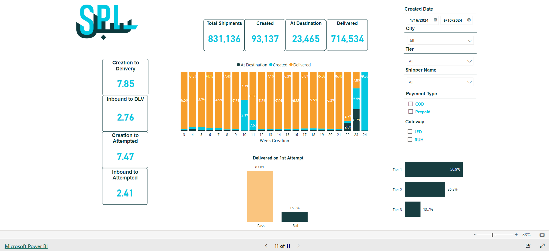
Figure 11- Executive Summary- Customers
Note:
This dashboard is still under consideration to determine which data should be shown to the customer's supplier in order to view the relevant information.